Updated
July 27, 2017
| By Bob Fugett ©2017
Haute Conduite

Red Ice Caverns - Mary Endico ©1991
in permanent collection of Asheville Museum, NC
(22" x 30" original watercolor)
"HOLY CRAP!" was my wide-eyed screaming thought.
Ed Whitney had triggered an epiphany realization.
"Oh, man! What he just said about watercolor design, it's exactly the
same thing composing music : painting — music ... it's all the same!"
So I started going with Mary to every one of Ed's classes,
hoping to further affirm
that my music observations were true.
Turns out I was right.
Above is the watercolor Red Ice Caverns by Mary Endico
which is currently in the
permanent collection of the Asheville Museum, Asheville, NC.
Below is a discussion on the use of offset 3-tuple, not
only in Red Ice Caverns but in other Endico watercolors which may or may not be
purely abstract.
Offset 3-tuple is a morpheme (and a universal) in the natural
universal language of aesthetic response (a semiotic language), and its use
helps unify and organize while adding interest to haute conduite Endico watercolors.
Works for music, too.
|
|
 |
|
Top:
|
Red Ice Caverns - Mary Endico ©1991,
from the permanent collection of the
Asheville Museum, Asheville, NC.
|
|
Lower left: |
An
example of offset 3-tuple,
an aesthetic response morpheme, a universal.
|
|
Lower right: |
Insert of
a 3-tuple over enlarged detail from
Botanical Rain - Mary Endico ©1979. |
Following is an overview of the basic organization using
offset 3-tuple as a foundation for aesthetic response in the Endico
watercolor Red Ice Caverns.
This is going to be easy for you, and that is a solemn promise.
You already have the basic tools ingrained in your DNA.
However, by their very nature, descriptions of aesthetic response
always leave
a lot to be desired.
Therefore, just like understanding math, if you haven't
done a tiny bit
of background reading you might get lost.
I assume you have read the quick and easy page:
Offset 3-tuple
With the basic concept under your belt we can move
ahead quickly.
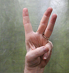
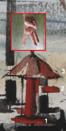
Close under the image of Red Ice Caverns
(immediately above)
is a photo of the offset 3-tuple hand sign; it is placed conveniently to aid
visualization of the painting divisions.
Go back up there, and take another look at the fingers
relative to the watercolor; you might guess what I am about to say.
Try to read the following description
and "see" the divisions before giving up
and using the numbered cheat sheet that comes after my little
walk through.
Here we go.
The watercolor is divided into three general areas that
double in size at each step
left to right.
The first division on the left is fairly well defined by the red
shape starting at the top of the painting.
The second division is slightly less explicit but
includes the area above the blue foundational shape beginning a sixth of
the way across the bottom and continuing to almost the center line of
the painting.
The foundation for the third shape of the offset 3-tuple is a dark to burgundy
horizontal area at the bottom.
The third division is slightly weakened because higher up
it is encroached by lighter red and some blue plus a portion of the very
light negative space, but the dissolution is caught, pushed back, and
pinned into place by the black triangular diagonal wedge.
Notice the absolute center line has been flirted around
but dispersed and avoided.
Ok, here's your cheat sheet.
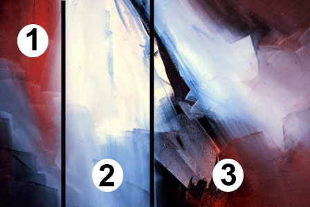
Now that you have seen the cheat sheet with
numbers, I can push a little harder.
The separation of the three areas is reinforced by a
descending movement into the apparent third dimension of depth, because reds appear forward while
blues recede.
This virtual 3D color control is possible because human
evolution has gotten people accustomed to seeing (in the real world) distant
mountain ridge lines always appearing bluer than the foreground — purple
mountain majesties, and all that.
Thus the strong red of one (1) appears closest, while
the cooler blues of two (2) are pressed back, and the warm (but not brilliant) red
of three (3) moves closer again; closer than two (2) but not so close as
one (1).
Whup, whooosh, stuhrump!
Excuse me, but I couldn't help it; this deeper discussion of
the use of color to establish perspective is a little outside the scope of
our current simplification to prove a point.
An offset 3-tuple (however you come by it) is a very strong
compositional element, not only in graphic arts but in music.
You can probably identify another few dozen offset 3-tuples
scattered throughout the Red Ice Caverns watercolor, like puzzles within a puzzle
... and more inside them.
Here's a startup hint: 1) vertically top down, a red, a blue, a dark
gray; 2) triple blue stripes at top follows the line of the black wedge; 3)
at bottom a black, a violet, and a gray slope up diagonally to the right; 4)
etc ...
But watch out: if you start looking too closely you'll run
into fractals, and I have no interest in explaining those little buggers to
you.
But here's something I'm glad to talk about.
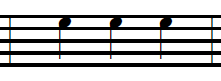
Below are two basic musical phrases, and they just happen to
be the first ones I thought of when Ed knocked my socks off with his three
fingered hand gesture.
|
 |
|
 |
|
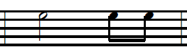
Figure 1 |
|
Figure 2 |
Both Figure 1 and Figure 2 are three musical notes, but Figure 1 is comparatively static and
uninteresting, while Figure 2 enjoys some added dynamic movement based on timing,
wherein the first note is longer than the final two which are shorter by
a doubled
half.
Musicians will see it right away, but if you can't
sing the rhythmic figures, have a musician do it for you.
Remind them that no stress should be applied to the
first note in each figure, just a steady even repeat of Figure 1
(a bunch
of times) without cadence or
metrics (they'll know what I mean); then do the same with Figure 2.
Exact pitch is irrelevant; choose a pitch and maintain
it; do it with a drumstick or a sledge hammer for all I care.
Do you hear what's happening in Figure 2?
There's your beginnings of rock & roll, brother!
In case you missed it:
Now a bonus comparison:
|
 |
|
|
|
Figure A |
|
Figure B |
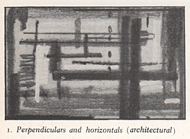
Ed Whitney established his own typology for all aspects of watercolor design,
technique, and process.Figure A is taken from page 65 of Ed Whitney's
book "Complete Guide to Watercolor Painting", and comparing this "architectural"
type with Figure B (the hydrant from Botanical Rain) proves Mary
Endico was a very good student indeed.
She painted her Botanical Rain plein air a few hours after one of the
classes in which she was studying such basic elements of design.
Amazingly, the now famous Botanical Rain watercolor was painted from
memory, and after passing through the scene portrayed only briefly.
Though she painted it from memory, it was not a magically enraptured
accident, for it was done with hard won sophisticated mental tools packed into
her head during the previous 19 years meant specifically for doing such work.
In review: Mary Endico has enjoyed a 40+ year career as a successful
watercolorist, doing what she loves, and selling more than 21,000 of her own
original hand painted watercolors directly one-on-one to collectors visiting her
studio in Sugar Loaf, New York — none of this has been an accident but came
about through rigorous application of sound artistic principles and practices
which are all available to anyone.
When people gush and comment saying something like, "Your paintings have such
depth, and the colors are amazing!" it is not immodesty when Mary replies, "Yes,
I know."
It is just a statement of fact.
Additionally, if looking closely, the elements of excellence that combine to
make her non-objective haute conduite watercolors can be seen infused in
all of her paintings down to the smallest mini-marsh.
The major factor setting her work apart from all other watercolor artists is
the strength and clarity of her work, and that is at such a level people often
mistake them for acrylics, and even a top technical administrator for Winsor &
Newton Professional Grade watercolor paints once commented, "I have never seen
anybody use our watercolor this way!"
Such a level of control cannot be gained through any other means than daily
hard work over an extended period of time.
However, whether Mary is working on a large haute conduite or doing a
smaller color matching piece within a wide range of subject matter, she is
producing work that is equally long lasting and high quality.
Numerous repeats of tiny moments of design excellence are found in small wall
hangings of all styles and major works suitable for permanent museum collections
alike.
She treats the smaller pieces like a vocalist treats scale work: a means to
stay sharp and improve the instrument.
Like I told you, music — painting ... it's all the same!
Mary's success is also a function of her family's multi-generational long
standing tradition of the:
Endico work ethic.
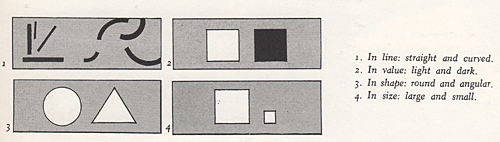
Startup illustrations for discussion of contrast/conflict typology, p.90
from: "Complete Guide to Watercolor Painting" by Edgar A. Whitney, 1974
|